Category

User Experience (UX)

UX Design Iteration

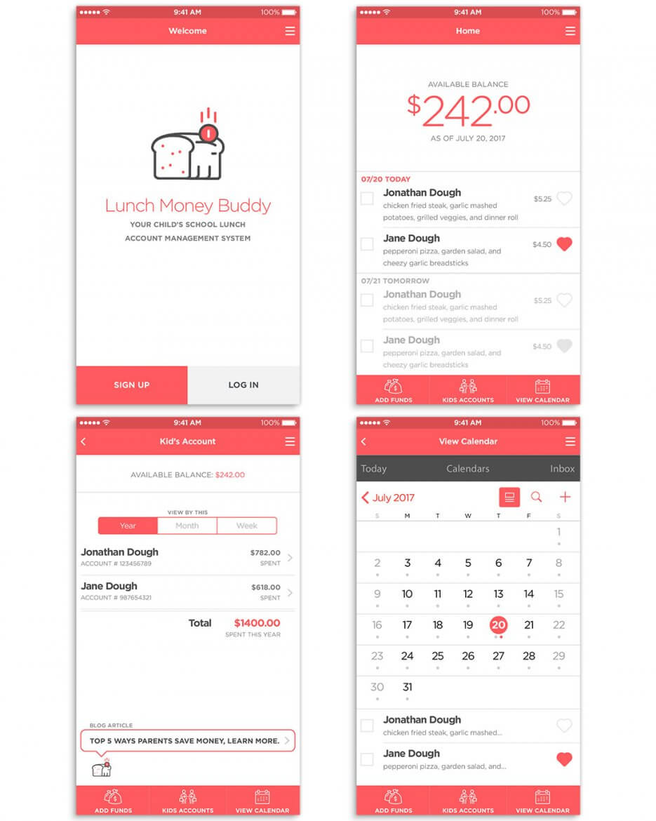
Iterative Design in UX Process

By User Experience (UX)

The UX process is a constant cycle of iterative designing and testing. We had several rounds of iterations from the start of the low fidelity wireframes until the current version of the Invision prototype, which you can see below. This is a critical process because you are always trying to raise the baseline bar of user experience and usability. Every phase that you go through you is hoping to have positive results continually. However, it is ok for you to try things so that you can try and learn different things. It’s not a failure or a mistake if you are learning from it; it only becomes a failure or mistake when you don’t learn from it or when you ignore the result outcomes from testing. It is vital at any stage really in the process to test early and test often. Getting feedback from others users and even your peers, you as the UX professional need to always keep in mind the true problem you are trying to solve for and whom you are trying to solve it for, it’s perfectly ok if you constantly go back to the personas; however at this stage your user feedback should also be aligned with them.

Practice Giving Feedback and Critique in the UX Process

By User Experience (UX)

Let’s start by making one thing very clear from the outset that a critique is not an attack on the individual designer, project team, stakeholder, or any other persons related to the project. It should always be coming from the view of the user (whether it meets their needs) and also thinking about the business objective as well, thus when both of these requirements are meet the project is moving in the right direction.

No matter if you’re doing an individual critique or a group peer review, the point of the analysis is to get feedback and also to start a conversation with everyone involved. Peer reviews are great cause you can get different individual perspectives besides those that have been part of the project at all.

This week after providing feedback to 15 other UX designers work, I started going back to my project and was able to see areas of improvements that I could make myself on my mobile app. This continued UX cycle of iteration, design, feedback, and also good to take a break every once in a while to step back. By doing so, this allowed me to gain a whole new perspective on my work from the gaps I currently have and also reflect on the things I was doing well.

Last thoughts are that when you can, take the time to critique and participate in the feedback cycle; it is a significant step as a UX practitioner.

Here are some great articles found:
www.nngroup.com/articles/design-critiques
www.rookieup.com/blog/give-receive-ux-design-critique
webflow.com/blog/how-to-give-better-design-feedback
www.uxforthemasses.com/design-critiques
www.uxbooth.com/articles/learning-the-art-of-critique
www.interaction-design.org/literature/article/how-do-you-give-feedback-on-a-ux-project

Microinteraction Feedback

By User Experience (UX)

Microinteractions are an excellent way to have users do a simple task that they can focus on one at a time without feeling overwhelmed with a page or screen they are on. I’d like to focus on microinteraction feedback, which Google is doing a great job at this right now. They are asking simple questions “is this helpful: yes or no” in some locations that they are looking to get feedback on OR in areas that you have first come to. This is great because it’s not too distracting or disruptive. Also, users don’t mind one tap action here because they know the info collected will only make the app better. How do they know this? They know because of the continuous updates that Google regularly provides. Usually, you see companies put an overlay star rating system OR request feedback that is about five questions long. That’s simply too annoying taking me away from what I’m there to do in the app. Bottom line, keep things small and straightforward when you want your users to provide feedback; it also doesn’t hurt give users a “thank you” or kudos for helping out; even letting users know that feedback they provided has been implemented will persuade them to help out in the future continuously.

High-Fidelity Wireframes

By User Experience (UX)

What Are High-Fidelity Wireframes?

_These generally comes after wireframe sketches or low-fidelity wireframes
_They have more details such as colors, font choices, spacing of elements
_Sometimes they contain real content, but not always
_All for placement boxes are filled with photography or color fields
_This will lead to more additional feedback and aim to move toward final design

With all that said, it really depends on the client and their ability to envision the creative process. Some clients are good with sketches to approve for designers to move into working on final design directions, however most clients need the help of going from low-fidelity, to high-fidelity, to final design direction. It’s always to communicate with your client to ensure your understanding of their expectations and deliver the creative to them as needed within the steps and deadlines they may have.

Ideation Wireframes

By User Experience (UX)

After determining the flow of the mobile app, it’s good to start with the initial ideation wireframes to visually see how some of the information will be organized. This is beneficial for the entire UX team and even stakeholders, especially if they are in a UCD or design sprint. We can identify if we are laying out the information in a way that users feedback has given us or if the personas will use them as expected. There is no one right direction to go, however, use the data from both your qualitative and quantitative studies has given you. You’ll never be able to design something for everyone, but do aim for the majority of the users. Doing several rounds of wireframes before going into full design and coded development, can save you time and gives you the ability to test with minimal effort quickly.

Sitemap and Design Iterations

By User Experience (UX)

It is important after making user journey that you start with your first version of a sitemap for your app or website. It doesn’t have to be perfect, it’s not final, and heck you can keep it on post it notes. Just as long as it is put on paper or the wall; just as long as the entire design team can visually see it. Why do we do this? Well, it is a high-level view of what we’re thinking of going with the design concept. Also, it allows not only people on the design team to see and modify; it also allows your stakeholders, content team, information architects, and others to view it as well. It then becomes a living document as you go through the process to validate your decisions and even necessary changes. As you go through usability testing and meetings with the business; you will see the first version will not be what the final version is and that’s ok. This is what being a user experience design practitioner means; it means you practice and iterates for the best possible solution that meets the business goals and outcomes.

User Journey

By User Experience (UX)

As I look back and think of the many times myself and colleagues, I’ve worked with, jumping from an ideation discussion right into design or development immediately make me think, “what the hell was we thinking?”

All that time and effort were going down the rabbit hole with no light at the end of the tunnel, because we were rushing into, “work to show something in production mode,” vs. figuring out our “why” in what we are doing, “is it the right thing for our customer?” Asking this simple question from the start and throughout the process is critical in creating a product or service that someone wants, willing to pay for it, and willing to invest their time.

Understanding your audience and the personas you’ve created will help you navigate the user to the goals and tasks they want to accomplish. Creating the user journeys will bring up the potential challenges that users may face and help you identify critical areas within your design to focus on to turn those into better experience opportunities. At any point in time, the emotional level of users goes into a negative one such as confusion, frustration, angry, upset, or just unable to find what they are looking for or even a way to get help; these are opportunities where better empathy within UX can contribute to creating better design. Thus, in turn, creates an overall better experience for the users.

Website Eye Tracking Usability

By User Experience (UX)

https://www.nngroup.com/books/eyetracking-web-usability/

This week we got to analyze gaze and heat maps from an eye tracking data from a usability study. The data was very valuable in conjunction with the videos of the participants to identify their challenges and opportunities that we have. The videos were also great as you can hear some recommendations and frustrations during the think out loud sessions. I learned this week if you simply look at the data it could lead you one direction, however, if you use both resources together (video and map data) it will take you into the correct path for making your design decisions and recommendations. It is vital after doing the usability eye tracking sessions to have a retrospective with the participant to gain further qualitative data from the study. Sometimes the data can show the participant seeing something on the screen, but they may not perceive it at all, ie. the ketchup bottle effect.

Importance of Post Task Questions in Eye Tracking

By User Experience (UX)

Eye tracking has been around for many years and has been a great tool for UX researchers. With technology getting better with the quality of equipment, improved accuracy and most importantly affordability; UX researchers are starting to implement this type of testing more and more. Eye tracking is great to see where the users are looking and gazing at, however, do not rely on the pure data alone. It is crucial that at the end of your usability test session to review the information with your participant and ask post-task questions to get more in-depth qualitative data. This will help you pinpoint areas to focus upon as opportunities and also to ignore areas that the user may be glazing around the page. You may also find areas where the user was maybe struggling to locate the information or action needed even though it could be staring them in the face, known as the ketchup bottle effect, and completely miss on what they are looking for. Finding the data patterns great in the eye tracking study, however putting that in context with the user’s actual feedback will help you determine the necessary changes that are needed

Mr. Tappy Mobile Usability Testing Device

By User Experience (UX)

The past two weeks we got to dive deeper into mobile usability testing and mobile gestures. After looking at several devices to use for mobile usability testing, I like Mr. Tappy product. The main reason I like this device apparatus is that it is lightweight, you can still hold our device as you naturally would, it comes with magnet or suction to hold your device in place; which can also be turned to landscape mode quickly, and that it comes with an HD camera. Having the users hold the device and not be stuck on a large bulky apparatus as others I saw on the market which makes you feel as though you are at the store using a display unit. Those testing devices do not allow the user to interact with it naturally and for us to clearly capture a participant’s gestures on the touchscreen accurately. Our main goal is to capture how a participant would interact with the device, website, or app as they would at home to identify their challenges and help us find opportunities to create a better experience.