


This case study research project came through KSU where we were tasked to create a lunch money mobile application for schools where parents and students can see how much money their kids have in their account.
The Project
I was asked to design a mobile app called “Lunch Money Buddy.” The app allows parents and guardians of school age children to manage various aspects of their kids’ in-school cafeteria lunch accounts. They wanted the parents and guardians to download the app and sign up for it using unique access codes that will be supplied by the school. Once they are in the app, they will verify and view their school attending child or children within the app to see their school lunches. Some of the basic functionality may include:
- View account balance
- Add funds to account
- Add additional payment options
- Default primary payment method
- Change a payment method
- Delete a payment method
- An auto-replenishment option
- View account balance
- View school lunch menu by child
- View subsidy status
- Favorite a lunch
- Close account
The Process

Personas
Samantha & Jorge
“We want to keep our children healthy and happy.”
This couple is both working professionals who are not morning people, so they pack their kids (Hailee and Brenden) lunches at night. They are rushing in the mornings, and they want quick access to the lunch calendar and menu. They want the app to be convenient, easy to refill the lunch account, get alerts from small balance, and access it quickly on the go. They both have advanced experience use of technology, their adoption to mobile is high, and their most commonly used device is laptop and mobile.
Henry
“I do my best to give my grandson a strong foundation”
He is a retired sales person who has the guardian of his grandson, Joe. He is more comfortable talking face to face with people and his interaction vs. use of technology. However, since Joe’s school is changing the lunch model, Henry needs to be able to use the mobile app. Easy onboarding and use of navigation will be critical for him to adopt the app quickly. He wants to be able to check the balance quickly and add funds without unnecessary steps. He has limited experience use of technology, his adoption to mobile is some, and his most commonly used device is the desktop computer.
User Journey Maps
The user journeys have been created by sketching different scenarios for each persona that would be relevant for each of them. In this document, you will see there are two separate scenarios for each one, and we started to narrow down realistic functionalities of the app from the broad scope.
The reasons we do user journey mapping is to identify potential hidden challenges that we may not have been aware of at the start. It also gives us an opportunity to create prototypes from the user journey on paper to do some initial usability testing and iterations before going straight into design and development. Getting some of the qualitative and some quantitative data first lets us know that we are creating the app in the right direction before spending additional time and funds in possible rework.

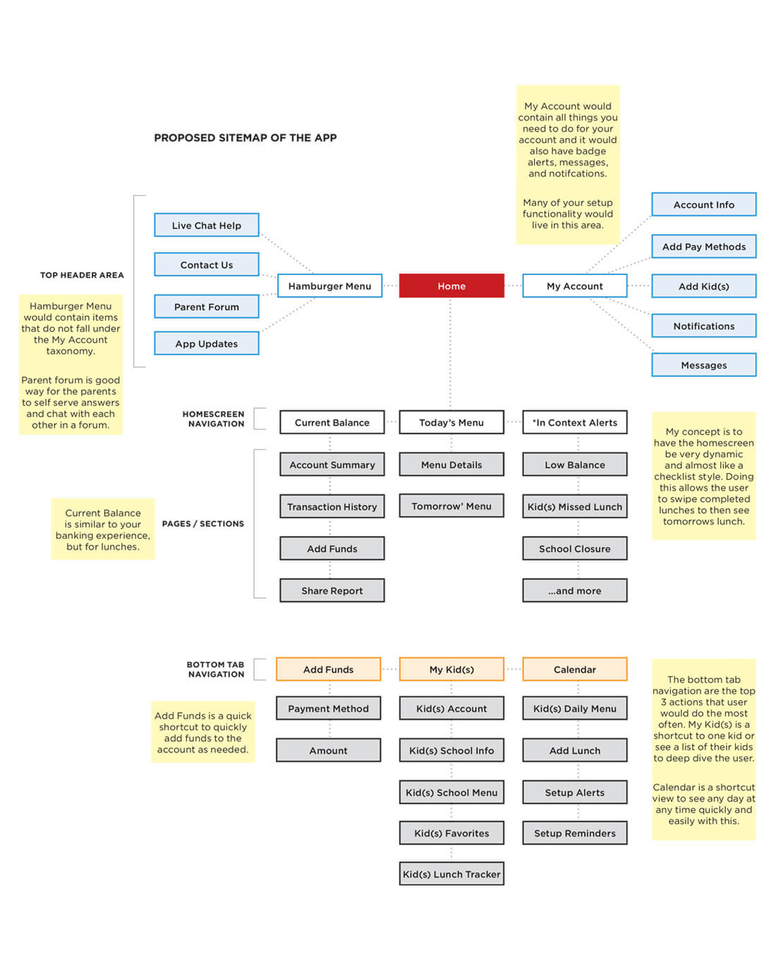
Sitemap
After the user journey maps, I created and proposed an initial sitemap for the Lunch Buddy App. The design concept of the app would be dynamic checklist style design with other functionalities such as the calendar, account summary, parent forum, live chat, and much more.
This design style would bring up to the surface the latest information that parents are looking for such as their account balance, what’s for lunch today, what’s for lunch tomorrow, and in context messaging that is relevant to the parents. The reason for this design style came from qualitative research that was done this week with parents and the information they were consistently bringing up that would be important to them they wanted it to be surfaced instead of being hidden behind additional navigation links, menus, or beyond the home screen.
Thus, we have proposed this unique app design in the sitemap that reflects what parents want to see and how they want to access secondary information.
Low Fidelity Wireframe Sketches
Sketching is my favorite step in the UX process and this part sketching what the app could potentially look like, as well as the functionality is advantageous. You start to see all the hard work that’s been done in the previous steps start coming to life. There are times where I catch myself saying, “I think that Samantha & Jorge will like the information here.” When you start to design and to put yourself in the shoes of the personas you truly are on the right track as you are designing with empathy.
Annotation Examples:
App Home Screen Notes – Total account balance shows the parents how much money is in the Lunch Money Buddy app for the school’s lunches for both kids (in this example). Overall, that’s the number the parents care about since the money comes out of the primary parent’s account and having proper balances didn’t make sense. Functionality is a checklist-style from the main app home screen. This lets the parents know: (1) if they have made the kids lunches or (2) they confirmed with a kid that their favorite lunch is tomorrow and they are eating at school. Once confirmed they had completed today’s lunches for their children and today’s menu minimizes with check marks for each child. Then tomorrow’s menu pushes up so the parents can see what’s going on tomorrow for lunch.
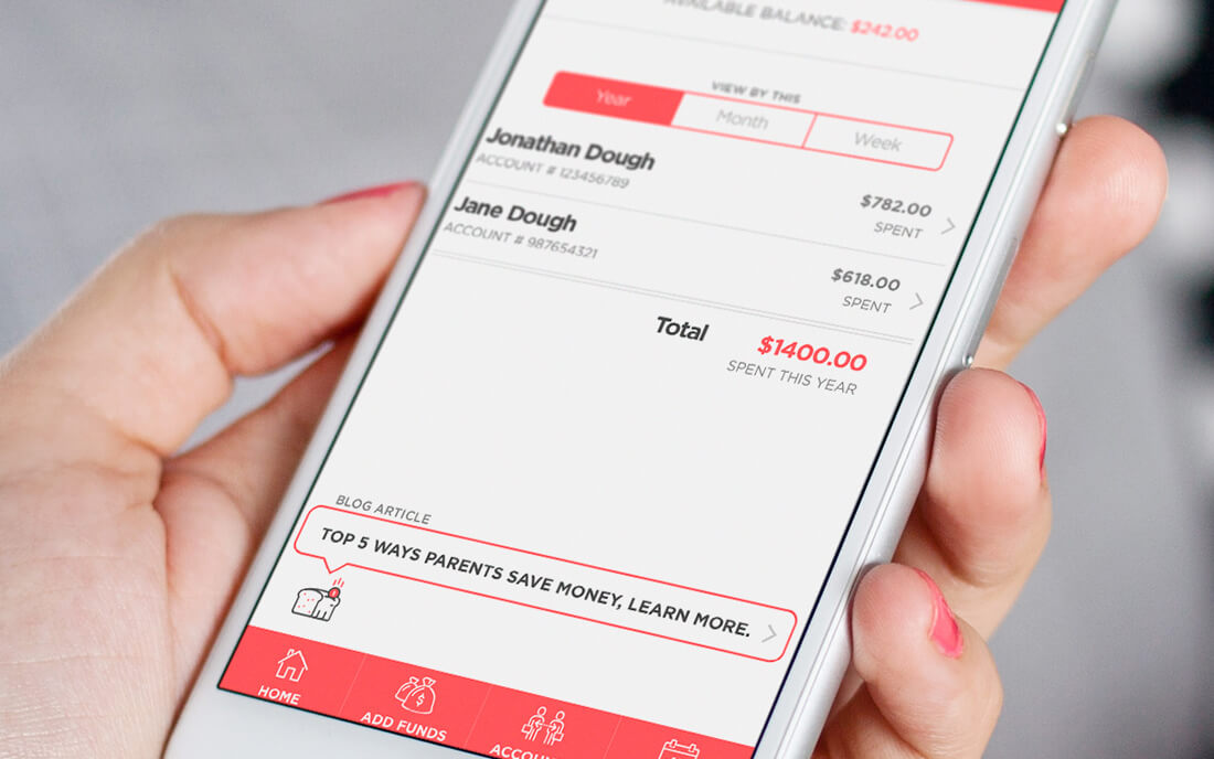
Kids Accounts Notes – each child with information related to each of them account number, how much they have spent, total there if there’s more than one child, you can modify the timeframe: year to date, etc. by taping on the link. There’s also personalize messaging to help parents showing them ways to save message box with ideas. Just like your banking app, you can tap each child to get transactional details.

Research
After doing some initial low fidelity wireframe sketches, I started to take the sketches to people that knew nothing about this app to get some qualitative data from users. I chose my users for a diverse set of backgrounds some that were a family with kids and some that did not have any children at all. I purposely did this to get data back from those that are struggling with their school lunches today in tracking (do they have money in their account? do I need to make them lunch to take? how much am I spending on school lunches? and more;) and to also get data back from those that didn’t have kids to get their thoughts as well.
High Fidelity Wireframe Comps
The design concept of the app would be dynamic checklist style design with other functionalities such as the calendar, account summary, parent forum, and a hub for the parents to quickly check their kid’s lunch account. This design style would bring up to the surface the latest information that parents are looking for such as their account balance, what’s for lunch today, what’s for lunch tomorrow, and in context messaging that is relevant to the parents. With the feedback from the group the past week, we’ve condensed the menu and my account items into one menu to avoid any confusion. Also, there’s an added quick help search feature for parents to find things they are looking for easily and quickly. An additional item of helpful blog articles was added that would be relevant to parents dynamically based on running account balances, spending habits of their child or children. These useful items are contextual help tips or links to articles as needed.
Annotation Examples:
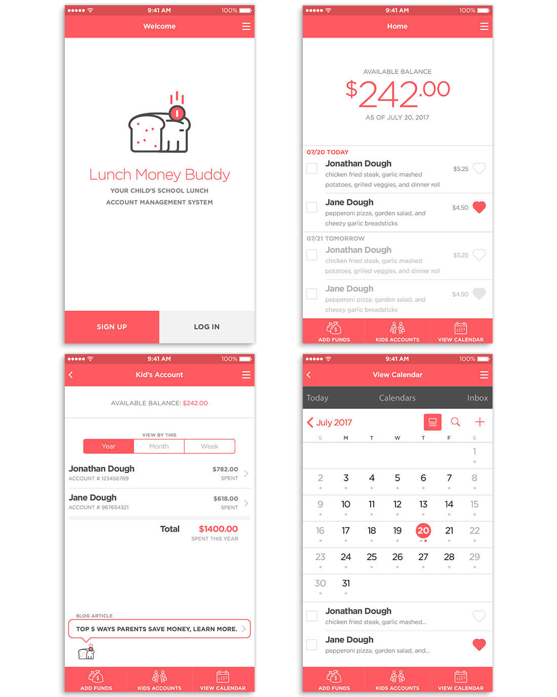
Sign-Up / Login Screen Notes – A simple sign up or login screen with a monochromatic scheme for a modern look a smooth feel. The sign-up button is the primary color to get new users to quickly find it and get them to sign up.
Add Funds Screen Notes – As parents are adding funds they can see what they currently have available in their balance. Next, they just enter the amount (numeric pad shows up here, not the alphabet keyboard), select current saved payment method or add a new one.

Iteration
The UX process is a constant cycle of iterative designing and testing. We had several rounds of iterations from the start of the low fidelity wireframes until the current version of the Invision prototype, which you can see below. This is a critical process because you are always trying to raise the baseline bar of user experience and usability. Every phase that you go through you is hoping to have positive results continually. However, it is ok for you to try things so that you can try and learn different things. It’s not a failure or a mistake if you are learning from it; it only becomes a failure or mistake when you don’t learn from it or when you ignore the result outcomes from testing. It is vital at any stage really in the process to test early and test often. Getting feedback from others users and even your peers, you as the UX professional need to always keep in mind the true problem you are trying to solve for and whom you are trying to solve it for, it’s perfectly ok if you constantly go back to the personas; however at this stage your user feedback should also be aligned with them.
Invision Prototype
Please use the link below if the prototype is not displaying, thank you.
https://projects.invisionapp.com/share/FHCW69G8J