Plan, Process, and Design

By User Experience (UX) No Comments


This week’s readings that covered design thinking and designing for the business world chapters of Design of Everyday Things really put things in perspective of what’s truly important in designing for functionality vs a design award. I find that when you sketch and plan your ideas on paper first you focus on the main goals that you want users to achieve and it’s core simplicity. Once you get a design down on paper you start to process and analyze each phase that you want users to flow through your web page, product, or application. Here comes the most difficult part the design phase when you start putting pixels on screen, I tend to find the stakeholders or business will start to add additional content, images, links, etc on the screen and you start to lose the core goals of the page. Stay strong UX designers! Here’s where you have to come in and be the voice of  the user and let your expertise shine and show the process of where we started, our goals, and be the voice of reason. Remember as a UX designer you are in charge of the true end to end experience and it’s a tough fight, however we have we are the voice of users. We are here to make things clear, easily understandable, easy to accomplish the main goal that the stakeholders have put down from day one on paper and it’s up to us to map the very best possible solution.

Design For Tasks, Not Screens

By User Experience (UX)
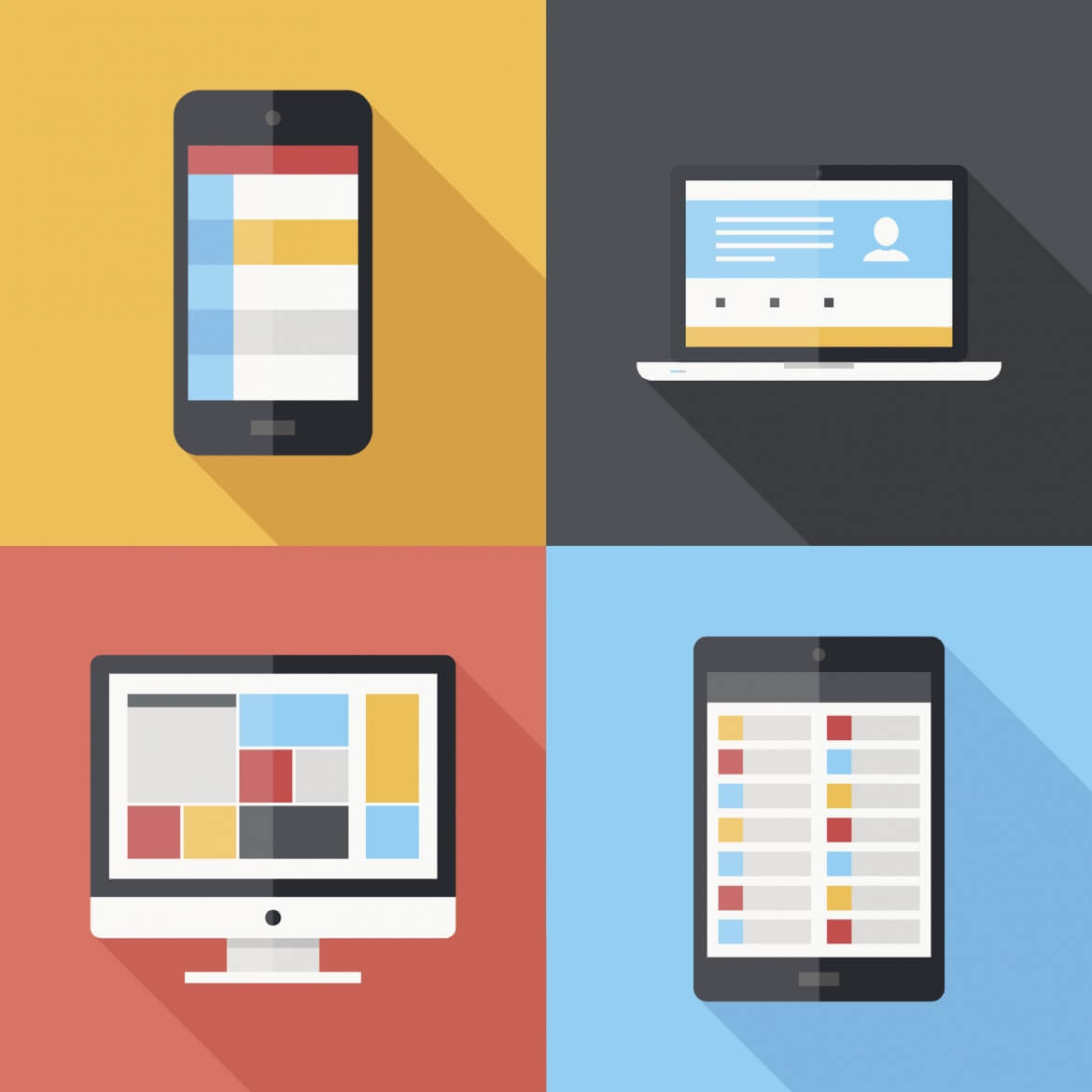
Vector illustration of application menu template on different electronic devices

Vector illustration of application menu template on different electronic devices

I found this from the 8 Habits of Awesome UX Designers, “It’s easy to conceptualize an app or piece of software in terms of volume of screens, but looking deeper is integral to the success of any product” being a very true statement.

Many times, well almost all the time as a freelance design firm, I would get clients simply wanting me to give them a quote only on a number of set screens. Of course I would have to do this in order to get the project, but do explain that there could be additional screens needed once we further explore the project and to achieve your main end goal.

Many clients seem to think that having a set number of screens for a website or application will solve the project they had set from the start. Many times this is on not the case and it will vary from client to client, but also from the type of industry or device that we’re building it for from the start.

If you’re truly hiring a user-experience (UX) and user-interface (UI) designer and you want to have the very best possible results, simply give some additional room if needed when the designer is fully immersed within your project as they will have additional perspective that you may not have seen or thought of yet that can help make your project, product, or service a success.

User Experience (UX) Terminology

By User Experience (UX)

Product and web design concept with a 3d rendering of related words and usability text highlighted with a yellow marker.

UX Journal Reflection – Week 2

What stuck with me this week is the terminology for example the Gulfs of Execution and Evaluation, Seven Stages of Action, and Gestalt Principles. While reading and doing research in each of these areas to find examples I found that I’ve actually been doing many of these principles and practices, however I didn’t know it because I wasn’t introduced to the terminology in the academic sense. We actually practice these when we’re doing our UX work as a team and during UCD (user centered design) 3-4 day sprints. It’s finally nice that I can group these processes, actions, and discussions together when talking about what we’re needing to do and why.

I really enjoyed the Gulfs because they break it down in a very simple and functional manner in which I can ask the basic questions of; Gulf of Execution: How do I work this? What can I do? When trying to achieve goal into the real world. Then Gulf of Evaluation: Is this what I wanted? What happened? When trying in the real world to see if I had achieved my original goal. That’s pretty straightforward and simple as it can get. Many times the business or stakeholders lose track of the single point of focus of their original goal in what they wanted their website to do, product to do, or application to achieve.

The Seven Stages of Action is what I consider what I do as a UX practitioner almost on a daily basis or project basis is right on point: Goal, Plan, Specify, Perform, Perceive, Interpret, and Compare. These steps is where you start to bridge the gap of the goal you had on paper and start to translate them into the real world, then review the results and see how that compares to the original goal you had from the start. These simple steps is a basic frame work to understand human interaction with your product and merely acts as a guide to your final design.

Gestalt Principles are Proximity, Similarity, Continuity, Closure, Symmetry, Figure/Ground, and Common Fate. I won’t be going into each one of these however overall great understanding of these principles I find to be very helpful and beneficial when doing UI work and laying out information on a page of a website design or mobile app. As stated before when you’re dealing with business and stakeholders, the only thing they really care for is to try and put as much information above the fold or crammed into an area with no regard to hierarchy or basic design principles in which users will see the design a crowded, bad design, and with no focus they won’t read the content or worse take the correct action desired by the original goal set forth from the start. As designers it is up to us to correct this visually so our main goals can be achieved.
Disney’s $1 Billion Dollar User Experience Investment

By User Experience (UX) No Comments

Disney Wristband by Ken Phillips

UX Journal Reflection – Week 1

Many of us designers can only dream to have a project that you can work on or be part of a team that has a hand in the end to end experience. Whether that experience is in re-branding a company, building an e-commerce website, or like Disney’s example the entire experience from the very start when a user interacts with the website or by phone booking their visit to the end of the trip till a family comes back home. Think about that for a moment about some of your worst experiences that you have in your everyday life or when you go on vacation. What if there was a better way to do things? What would your life experiences be like?

When you first see $1 billion dollars, you think wow that’s a lot of money for any company to invest and why would they do it? Simply ask yourself the question, “If I wanted to create the Disney Magic Experience at our theme park for our customers… What would I want as a kid?” When you start thinking of all the blue sky ideas, jot them all on the whiteboard all the ideas that you can think of and do this from the eyes of your inner child, or better yet ask your child or interview kids. You’ll start to see a trend. Bottom line as a kid all you want to do is come to Disney World, and you want to hop on the rides or see the shows as soon as possible. You don’t want to waste time. So make it easy for me to get to the park, no need for me to check into my hotel or room, no waiting in long lines to get on a ride or buy tickets for the show, no wasting time looking at the menu and ordering food at the restaurant and much more.

When you have a single focus to solve a problem that all you need is the wristband for your park admission, room key, fast pass, payment method and it doesn’t tell time. Disney wants you to enjoy your vacation and not worry about the time. They want to have your time run efficiently as possible so that you have more time actually experiencing your vacation vs. wasting time by waiting in lines or making decisions what to order or do, etc. then your vacation experience is truly an amazing experience that you will feel was well worth the cost once you get home.

To learn more about this, visit: http://www.wired.com/2015/03/disney-magicband/

Save

Leather Head Sports

By Product Review No Comments

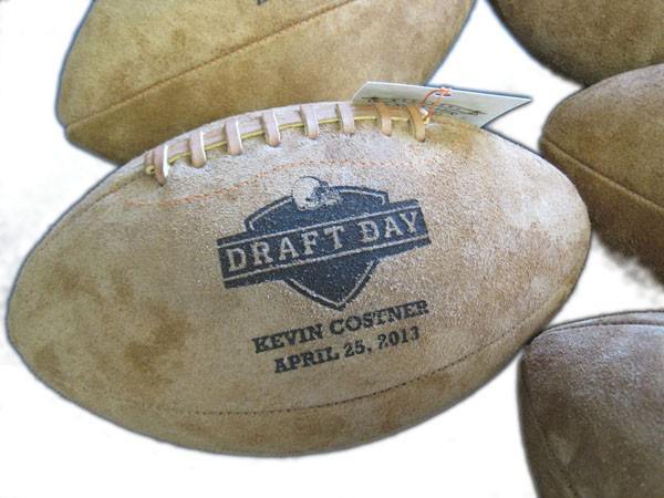
Draft_Day_football_600_1024x1024

If you’ve never heard of Leather Head Sports, that’s okay; neither had I until not too long ago. This small company of skilled artisans creates handcrafted, custom made footballs which resemble the ones made years ago before factories churned them out by the hundreds.

I first got acquainted with Leather Head Sports after seeing some unique footballs that were used as promotional items for the Kevin Costner and Jennifer Garner movie “Draft Day”. When I saw those footballs, I knew I had to find out who made them and get one.

After learning more about the company, I chose Leatherheads to produce three custom made footballs. One of the main reasons I chose them is their reputation for doing high quality work with the best materials available. The leather for every Leather Head ball is tanned in America. Side note: the leather used to make my McGuire Design football was from the same suede material that was used for the Draft Day footballs!
Read More

Award Winning Logo & Website Design Firm Opens In McAllen, Texas

By Announcements

blog-mcallen-map

The way in which companies do business has changed dramatically with the ever-increasing popularity of the Internet. More and more people are logging on every day, and it is now through search engines that people find the products and services that they need. If you have a business, big or small, that does not have any kind of online presence, you are in real danger of falling far behind your competitors. There are ways to get your business online that can be done on your own, but if you really want to show off your company in the best light possible, it is always best to hire a professional design company like McGuire Design out of Texas.
Read More